Brand Type for Publications
Monday, June 13, 2016, 6:30 - 8pm
Add to Calendar
This free, public lecture focuses on three case studies of typography associated with a magazine brand, until it wasn't: Rolling Stone, Newsweek and Premier.
Publication designers understand that the lasting identity of a magazine or a newspaper is its type. The text changes. The pictures change. But, over time readers get familiar with the type. It becomes part of a publication’s personality, its identity. Its brand.
How do you choose the type? Are there different identities for text and display? Do you have to order up a custom font? What about the logo?
These are the questions you consider with the typography of any publication—digital, print, or both.
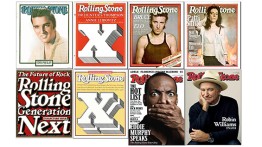
Roger Black presents three case studies—all custom, and all revivals, to some degree. The first, Rolling Stone, a 1970s custom type by Jim Parkinson, based on 19th century Jensons, has stood the test of time. At least until now.
The 1980s Newsweek commissioned Parkinson to make a black, British Grot, later expanded to many weights and widths by David Berlow, and used by the magazine for 15 years. No longer. But why?
The 1990s revival for Premiere of Dwiggins’ Eldorado by David Berlow was even shorter-lived. The U.S. edition of that magazine shut down in 2007. This typography, Black suggests, should have been timeless.
You be the judge.
This lecture is free, but registration is requested.
For 40 years, working with magazines like Rolling Stone, newspapers like The New York Times, and web sites like Bloomberg.com, Roger Black has been developing ways to communicate content more effectively. His teams have redesigned Reader’s Digest, Esquire,Scientific American, the Los Angeles Times and The Washington Post.
In the fall of 2011, Black helped with the launch of The Sporting News, a hybrid iPad app built on the Treesaver, the HTML5 publication platform he helped develop. He’s been working on web sites since 1995, and was involved with some early influential designs, including MSNBC.com and @Home Network. He’s working closely with three new companies providing media design products:Webtype, Ready-Media and Treesaver. A partner in Font Bureau andDanilo Black, both founded in 1989, he works from small studios in New York, Austin and Pass-a-Grille, Florida.
This lecture is part of the Herb Lubalin Lecture Series of Type@Cooper. The series is sponsored by the Herb Lubalin Study Center of Design and Typography at The Cooper Union, a public graphic design archive which places emphasis on a hands-on access to a wide range of design and typography ephemera.
Located in the Frederick P. Rose Auditorium, at 41 Cooper Square (on Third Avenue between 6th and 7th Streets)