Stephen Doyle on the Cooper Union Logo
POSTED ON: June 1, 2009
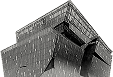
“Provocative” is the word that was the genesis of a new logo for The Cooper Union, and it was Milton Glaser’s. It summarized his ideas about how to represent such a pivotal hotbed of curiosity and accomplishment. Without describing a look, Milton nailed, with just one word, the way a logo appropriate for The Cooper Union must act. Any designer, even a pro bono one, would recognize the slap of glove across the face when asked to design something “provocative.” It is, in the realm of design, a challenge to a duel: a duel between the act of design and potential of imagination. Do not be mistaken. Duels are scary. There was a lot riding on this one, and there were a lot of onlookers. But why a new logo, and why now? Cooper Union is literally in the midst of a transformation, one so robust you can see it on Google Earth! The new academic building rising on Cooper Square is dramatic proof of unconventional thought thriving at Cooper. Complementing this, and coinciding with a 150th anniversary, a new logo could graphically signal Cooper’s vitality, its complexity, its energy, and its unity. Dr. Campbell said a new logo should “transcend history, tradition and culture, and embrace the future.” Other members of the logo committee (there is always a “committee” associated with anything pro bono) wanted the logo to “push boundaries” or represent “light, motion and transparency.”
![]()
Naturally, a designer does not merely build on other people’s ideas, but tempers them with a few of his own. I was able to draw on my unique history with Cooper, having been at different times a student, a teacher and trustee, I had a sense of the different constituents, and their different points of view about the college. Intrigued with the current hot-button issue of the dialog of science and art, and recalling the striking dedication mounted to the building’s north portal, at about the sixth floor, I wanted the new logo to somehow address the difference between science and art, as well as their union. For me, it seemed like the two sides of the brain… different thinking, but inextricably linked, mutually dependent—and just so much fun when you put them together.
Happily for me, I did not face this duel alone, but brought the challenge to tackle “provocative” back to my studio of ten. Several of us explored diverse directions of name treatments, emblems, initials and even optical illusions. (How "science and art” is that?) But ultimately, the winning design, conceived by Jason Mannix (unfortunately a graduate of James Madison University, despite the three Cooper alums here) was chosen because it most closely aspired toward that one inalienable Cooper Union attribute: the imagination. The logo is rooted in logic. If you draw a C or a U as a square form, you would arrive at our basic module: three planes that intersect at right angles. If you twist the U one rotation, its three planes would complement the three planes of the C, creating a perfect square, an ideal geometric form, useful in engineering, art and architecture.We have allowed our planes to intersect just at their points, and we have encouraged them to be transparent. If each half were thought to represent art or science, notice that each is comprised of three elements. Those could represent each school. If that were true, which it probably isn’t, then each school would have a foot in both science and art. The three primary colors are the genesis of all colors, and this little baby looks really cool when it spins. Much attention has been paid to this logo on design blogs. One of the “criticisms” noted is that it resembles a box kite. Made of wood, paper and color, a box kite is something that, with a little wind, lifts itself up proudly into the air, and can spend the day there, floating overhead, tethered to earth with just a piece of string. Like our Alma Mater, it simply defies gravity.